It may at first seem like all the popular apps are very different from each other. After all, what does a video conferencing app have to do with apps that are used for text messaging, posting short videos, or finding your way around a city?
In fact, quite a lot. It doesn't matter what product your company specializes in. You need an app to function as a storefront and branding platform, and there's a lot you can learn from the world's most popular apps.
Wireframing
If you look closely at some of the leading apps, you'll notice that they share overlapping aesthetical sensibilities. "Wireframing" is an important design concept that ranks the importance of app features and then, based on this assessment, places them in an appropriate place on your app.
Apps that serve very different purposes or functions may have a very similar design language. Just like websites have design patterns, such as headers at the top with links or contact information, apps that are otherwise different from each other may look alike.
In cases where apps look different, they still underwent the same underlying wireframing process. Only the features were laid out differently because the apps had correspondingly different needs.
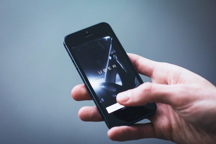
For example, the Uber app and WhatsApp are nothing alike in terms of function. Uber devotes more space on your screen to the local map of your area, whereas WhatsApp's home screen has three horizontal headings and a vertical list of past conversations.
They might not appear to have undergone the same process at first glance, but wireframing dictated their choices. Big cities are full of knowledgeable developers, so it's crucial to find a mobile app developer in Toronto who takes creating user flow and logic seriously.
Make it Addictive
One of the keys to developing a popular app is keeping users on the platform. Naturally, addictive apps get more engagement. You can use certain tricks to keep users on the app for more extended periods of time, though the nature of your product may dictate which tricks you can and can't use.
For example, Twitter's constant stream of news is designed to encourage users to refresh it constantly. Each time they do, they are rewarded with new bits of news or new content they can read or watch.
Likewise, every time they receive a notification, the user gets a satisfying dopamine rush that is likely to keep them on the platform. Notifications are hard to ignore, and the notification symbol's design and placement are meant to stick out and almost cause some irritation. This way, the user is driven to click on a button to make the notification disappear, but clicking on it only encourages more engagement.
There are concepts known as "dark patterns," a form of design trickery or manipulation that you can avoid partaking in. Have you ever noticed how difficult it is to cancel certain subscriptions or how some companies seem to deliberately use confusing wording to benefit themselves at the user's expense? There's a difference between nudging the user and exploiting them, but designing your app to be addictive doesn't have to be nefarious.
Clean Space, Not Too Much Information
The leading apps don't try to overwhelm users with information or stimulus. Smartphones are not exactly large screens, so there's no need to make your app too busy.
Negative space can be very compelling. Not only that, but people aren't likely to read a massive jumble of text. If you need to communicate a lot of information, set it up in chunks or spread it across pages so that the user is never overwhelmed by an excessive amount of text.
Look for an app development company that takes user testing seriously. It's crucial to see how actual people respond to the prototype, which requires strict protocols for real testing.
These days, there's an app for everything, or, more likely, multiple apps. You might not be trying to build an app for ride-sharing or posting ultra-short videos, but there's a lot you can learn from the makers of the world's most popular apps.
© Copyright 2026 Mobile & Apps, All rights reserved. Do not reproduce without permission.


